WFA Wrestling Social Media Graphics
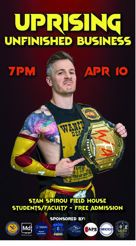
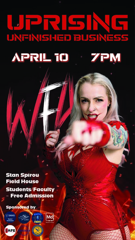
These are two wrestling social media graphics I did for my studio class in the spring of my Junior year at SNHU. Graphic design majors are put into teams for the studio class to work with real clients, and my team is WFA Wrestling.
PSA: The graphic on the right looks washed out on WordPress. It is not supposed to look like it has a fog overlay.
Sabrina Carpenter Poster
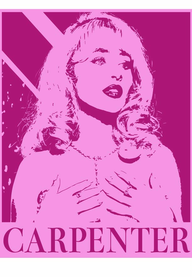
I designed this poster in my first semester of Junior year at SNHU. I received feedback that it would make a great T-shirt design and that this type of design is so timeless.
Decades Design
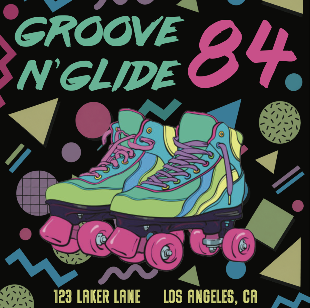
During the fall semester of my senior year at SNHU, I was assigned to create something from a different decade of my choice. I chose the 80s because I love the 80s. I created a little ad for a roller-skating rink. It looks dark in this JPEG; it is more vibrant in PDF format.
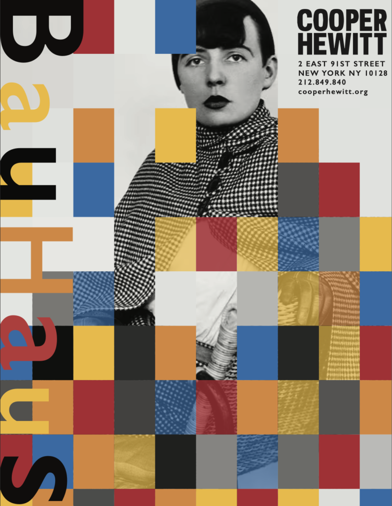
Bauhaus Poster
I created this poster for a Bauhaus design assignment in my first semester of Junior year. My professor ended up putting it in the fall show.
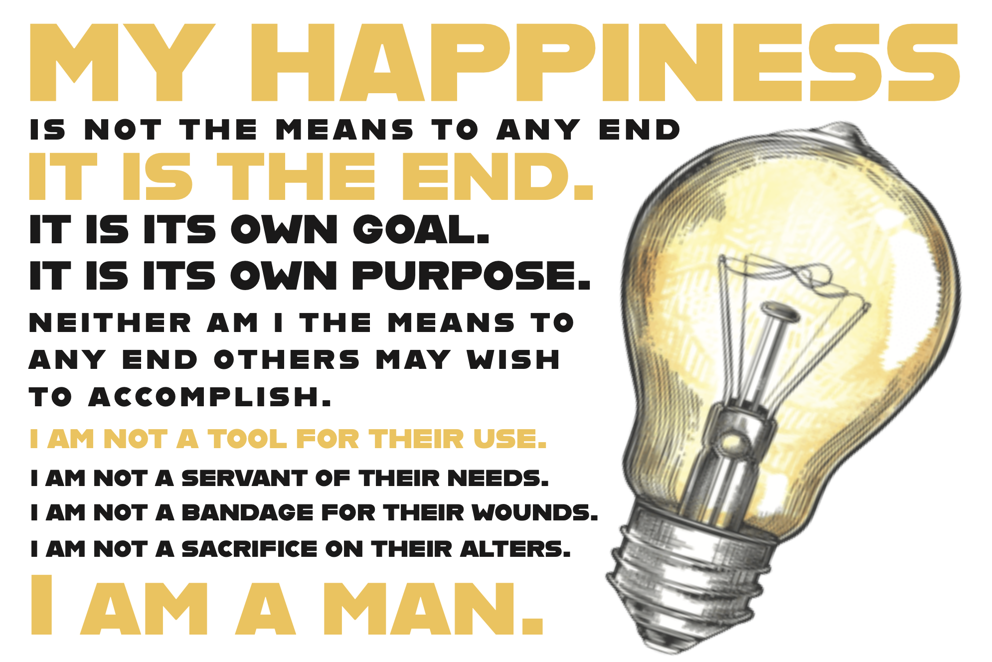
Anthem by Ayn Rand Quote
In my first semester of Senior year, I was assigned to create a design focused primarily on typography, with very little imagery. The only imagery is a lightbulb, a major symbol in the book that represents the power of independent thought, personal achievement, and individual ingenuity.
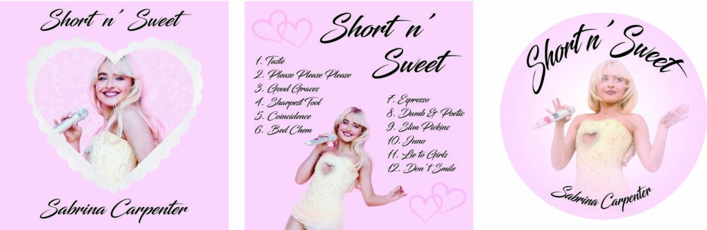
Sabrina Carpenter Album and Vinyl Design
In my second semester of Junior year at SNHU, I designed an alternate album cover and back for her Short n Sweet album, as well as a vinyl design. This was a lot of fun, and I would like to do more of these in the future.

Bakery Icon Design
In my senior-year fall typography class, we were assigned to design a bakery icon using only the letter M. Here is what I came up with.
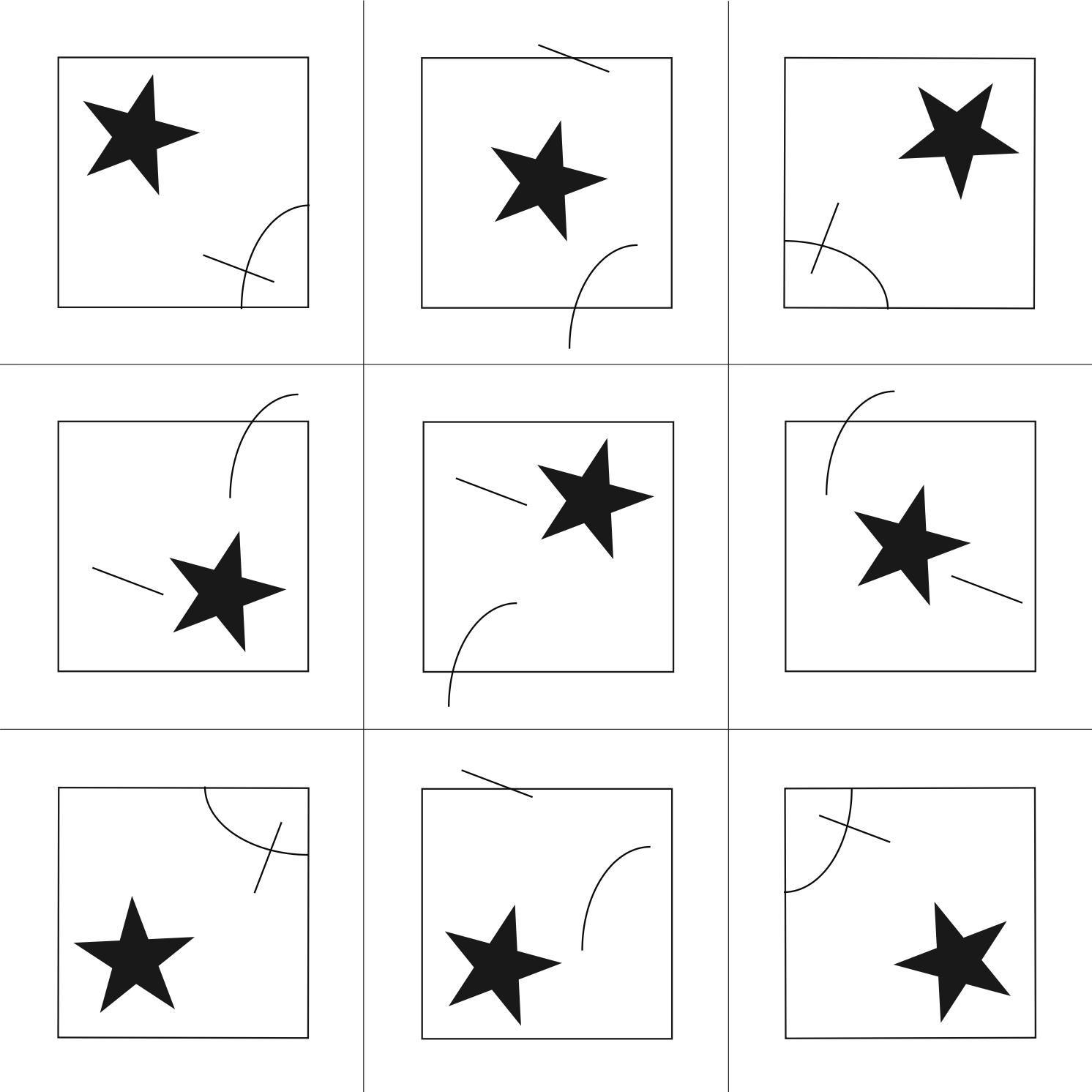
Sign Systems
In my senior-year fall typography class, we were assigned to create an “alphabet” with 3 different shapes or lines. Each one had to be different but use the same 3 shapes/lines.
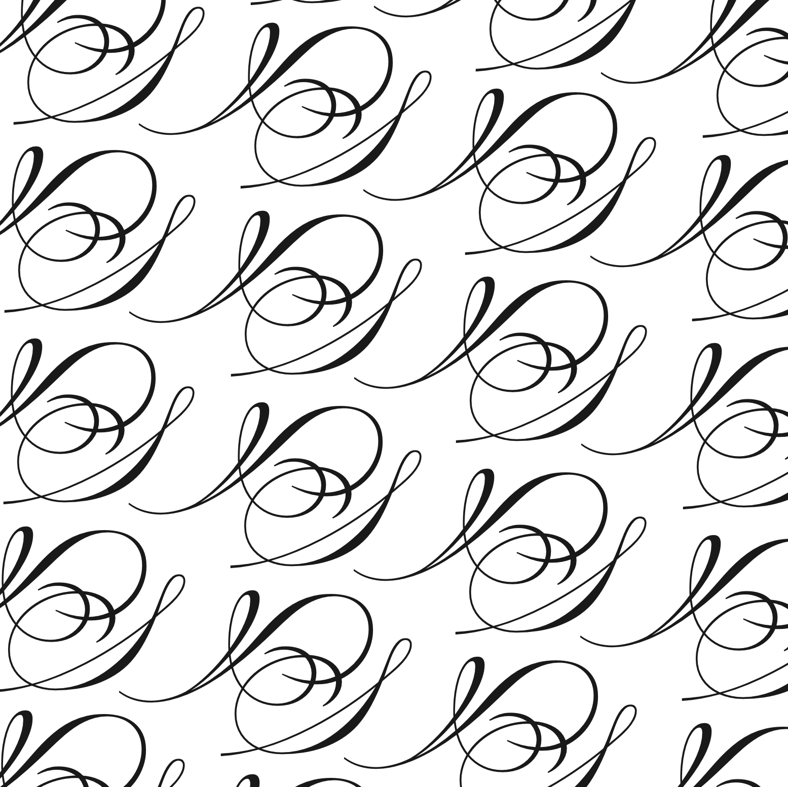
Type Pattern
In my senior-year fall typography class, I was assigned to create a two-letter type pattern. I used A and S. I liked the font’s fanciness and how the A and S worked together to create a pattern.
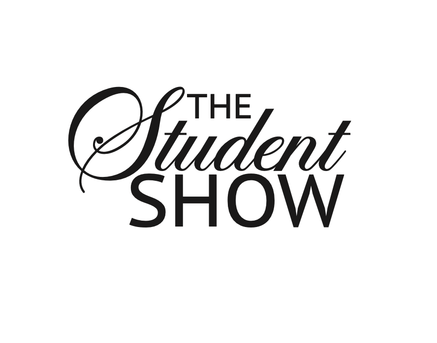
Student Show Logo
This is the Student Show Logo I designed for the SNHU student show in my first semester of Junior year. I was tasked with creating a logo suitable for stickers. It is black and white because they hadn’t decided on the colors yet and would add them later.